


After I mentioned I had asked the internet readership to help us choose a new vessel sink, the Guy announced he has a definite preference and that he is a Super Delegate and therefore gets two votes. I have a different choice of sink but as I threw it open I will of course abide by the majority's decision.
He is concerned that I didn't give you a choice to state you think all four were horrible. So if you hate them all, have a better suggestion or have a reason why you favor one vessel sink over another send me a comment. 
Each of the above has at least one vote.
It seems no one is into the Red Spiral, are the swirls too distracting perhaps?
To help us with the decision we visited Color Chart: Reinventing Color, 1950 to Today at the MoMA in Manhattan. It was a fabulous show, possibly the best I've seen there since they expanded MoMA, but we are no nearer reaching a concensus. More about the exhibition over here.
Saturday, March 29, 2008
The power of democracy
Vote for the hottest red vessel sink
The red vessel sink that is central to the design for the powder room arrived yesterday and it is HORRIBLE. The foil was peeling off, leaving some of the glass and some nice aluminium exposed, which might go with the stainless steel doorknob or might look like NASTY OLD CHIPPED CHROME. Described as deep cherry red it turned out to be a sickening shade of puce. This is not the look I was going for so I'm returning it.
I need to pick another sink asap and I've narrowed the choice of vessel sinks to four, all by Ronbow: Red Crackle; Red & Black; Red Spiral; and Red Marble. I'm asking you to help me decide. Click on the links for a full description of each or just look at the mock-up below and tell me which will sit best in the renovated powder room?
Remember this will be the only spot of colour in an otherwise monochromatic palette. The other materials are: black vanity with a Carrara marble countertop, chrome faucet and hardware, chrome framed mirrors, grey porcelain tiles with white and black veins.
So what do you think? Vote now for your favorite
Thursday, March 27, 2008
Spring clean up

Do you see what that is? No, not the cute dog with the dopey expression on his face. Up a bit. In the glass? That bright circle in the middle? It's my flash bouncing off the window because it is so freakin' clean. It's taken three years but we The Guy has perfected a system that leaves the windows cleaner than before he washed them. Hurrah. Who knew it was more difficult than rocket science?
Not to be outdone, I rearranged the laundry room (again) and I will reveal the new, great plan to make this room a fully functioning space again at some point in the very near future.
And the landscaper/font of all house knowledge guy came out and cleaned up the yard, including hauling away the dead azaleas (yes, it turns out we lost a couple this winter) but unfortunately he also took the branch that was holding up the fence, so I suspect that will be falling down again soon.
But the yard looks good, and what's better I can see it now through my sparkling windows.
Wednesday, March 26, 2008
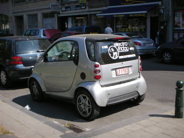
Smart Car comes to NY

I was driving through Huntington on Sunday when I saw my first American Smart car. The Smart fortwo (which I once read as Fort Wo until it dawned on me it was For Two. Yes I can be a little slow sometimes!) is available in three models, the Pure, the Passion, and the Passion Cabriolet, starting at $11,590. Billed as the answer to inner-city parking problems and rising fuel prices, I knew they were coming - we have two dealerships in the area so I'd seen the cute little dinky toys on the garage forecourts - but up until now I hadn't seen one on the road.
I have to say they look incongruous here. Maybe it's because the roads are so much wider than in Europe, or there are so many more SUVs and minivans, or the trucks are so huge but that Smartcar looked like a golf caddy that took a wrong turn at the 18th hole and found itself out on the highway.
Speaking of highways, I wouldn't take a Smartcar on an American interstate any more than I'd take a bicycle. Those bigger cars just wouldn't see you, not while the drivers are busy drinking coffee, applying make-up or reading the paper, which is what goes on here. A lot. I know this because we used to have have one of these and lots of just didn't see us.
I looked at buying a Smartcar when they were launched in Europe about 10 years ago. The local dealership was just up the road from my house and I was intrigued by the various models featured in the glass tower visible from the autoroute. 
In the end though, the hype didn't measure up to reality. I couldn't park the thing any easier than I could the car I ended up buying, a Renault Twingo. The Twingo was also cheaper, had a similar gas mileage and was much roomier inside. (It was more a forfour than a fortwo) I also think it was better designed, resembling a cute baby carriage inside but a real car on the outside. The Smartcar? Stick a pole on it's back and it looks just like a fairground bumper car. But the Twingo isn't available here and the Smart fortwo is, so look for them on a street near you in the coming months.
Tuesday, March 25, 2008
Billy Buttons

A week or so ago I posted this photo and mentioned I didn't know the name of the flower. While wasting time reading other people's blogs working today I came across this post from the Happy Living Blog. Turns out they are called Billy Buttons or Craspedia and there are lots of other varieties. I don't know why I'd never seen them before, but they are such a vibrant yellow and so small and cute they make me smile. They are also a nice change from the ubiquitous tulips and daffodils at this time of year and they're holding up really well in this bunch of flowers I shoved in a vase over a week ago.
Window shopping on the web
I'm currently lusting after a couple of items I've seen on auction sites on the internets. 
First this modelicious 1970s Pucci Rocker available on 1st dibs. I'm totally in love with it but I think it's just too much for this house, although it might go here.
On the other hand these classy Lithic Floor Lamps, also from the 70s at Vintage and Modern are totally modern and in keeping with the style of this house. They are still produced today by the original manufacturer, J. Robert Scott so I can keep them on my wish list for now.
Monday, March 24, 2008
Numbers, more numbers
House numbers that is. After a recent warning that the fire department might not be able to find my house in an emergency despite the numbers on the light post and the pillar by the front door, I have been searching for the perfect modern numbers in bronze to match the mailbox.
Some were too shiny
Some weren't modern
Some were just too expensive 
But last week I found the perfect house numbers. Modern typeface, 4" high, in a bronze finish no less. And even better, these are floating house numbers. Best of all, they were only $5.99 each.
Guess where I found them? Home Depot of all places, in the hardware section far away from the mailboxes, hidden away by the "For Sale" signs and the stick-on numbers. And they had all three numbers in stock. (For some reason the #2 gets sold out first.) I grabbed them and The Guy drilled them into place on the cedar light support at the end of the garage drive, next to the mailbox.
So now we're covered. Should we require an ambulance, fire truck or police car in the future I expect them to have absolutely no difficulty finding us.
It's a long way to go

This is the Easter egg I wanted yesterday. The one on the left. From my favorite chocolate shop in the world L'Art du Paslin, Wavre, Belgium. Third-generation handmade chocolates, the best ingredients: butter, cream and of course dark, milk and white chocolate. What could be more perfect? The smell, the rich, chocolatey smell of the pralines, that's the only thing that's missing from the video below.
Sunday, March 23, 2008
Easter = ikea
A trip to Ikea to buy some cabinets to finish the laundry room was a big fat bust. I had everything planned out, wall and base cabinets from the Udden range in clean, mod, white and stainless steel, plus a Mossby stainless shelf but, as so often when we get to the store, we started to second-guess the plan. To replace the existing sink countertop where the cats feed happily away from the ever-hungry dogs who would otherwise devour their treats, we could have either a free-standing unit with a single sink that would leave enough room for the cats to feed (just) but there would be a 9" gap at one end and that would be really annoying (you try scraping dried-on cat food out of a space that size)or a unit that would fit exactly that comes with a double-sink meaning the cats would have to eat in the sink. Rats. Thwarted once again.
So we came home empty-handed and cleaned the laundry which didn't make me feel even the teeniest bit better about the waste of time and fuel.
My mood wasn't made any better by listening to a segment on NPR about chocolate for Easter and hearing Chocolate Dinosaurs were a big seller. Because now I want a chocolate dinosaur and I didn't even get a little egg.

Saturday, March 22, 2008
Spring has sprung
I gathered in all the snow sticks (it's been a really unsnowy winter this year on Long Island) and noticed that things are starting to come to life again in the yard.
Bluebells starting to bloom under the maple tree.
Day lilies are pushing through all over the front yard. And so, you will see if you look at the top of the photo, are the weeds. The Forsythia has a distinct yellow tinge and there are buds on all the branches. A couple more weeks and we'll be seeing a lot more green and a lot less brown out there.
Which leads me to a question: If spring has sprung why is it so damn cold?
Thursday, March 20, 2008
Go ahead, lick the screen

via Blinkdecor
French sisters Anouchka and Cassandra Lefebvre De Lange at Le Tramac take antique and vintage furniture and restore and re-upholster it in bright jewel-colored fabrics that just scream "Touch me". 
Wow.
These pieces aren't cheap though, the cabinet is approx $2,500. But think what you could do with a junk-yard find, a few basic tools and some bright paint.
Don't they inspire you to take on another project?
Silver mosaic tiles

Porcelanosa Line Blanco wall tile with Mosaico Touch Silver accent (left)
While we were out shopping for floor tiles for the powder room last week-end I came across a new line from Porcelanosa that would work great as a backsplash in a modern kitchen or bathroom. Mosaic Touch, available in Silver or Graphite colorways, are 12"x8" ceramic mosaic tiles like the ones I put in the boys' bath last year, but these shiny beauties look like patterned stainless steel. 
The advantages are the price, $6.50 per tile, and the ease of installation - just treat them like ordinary ceramic tiles, butter the back, stick them on the wall, pick a co-ordinating or contrasting grout, float it over, wipe it off and voila. It looks like mosaic but at half the cost and half the time.
Wednesday, March 19, 2008
BHG re-upholstery guide
Better Homes and gardens have step-by-step instructions on how to re-upholster a slipper chair. With 5 yards of fabric and a few other odds and ends including a camera you can turn 
this boring brown chair
into this beautiful blue asset.
There are more how to upholstery guides here
Powder room: the fixtures

No gold tiles or bejeweled faucets but a splash of colour from the vessel sink amongst the sea of gray tones
Little yellow ball

I have no idea if it's a type of chrysanthemum but it came as part of a bouquet of flowers. I just know that it's tiny, yellow and unbelievably photogenic.
The dressing room light

Of course if you are going to take down the light in the dressing room to use in the powder room you have to put something in its place. Luckily (or part of my devious master plan to drive The Guy crazy) I had a spare halogen light fixture from the master closet light improvement project. Unfortunately when The Guy removed the fixture he revealed a circle of Navajo white that didn't match the surrounding super white paint. But luckily again, I had a can of that left over, so all we had to do was give the circle a quick coat of paint and voila. Right?
I'll spare you the photos because here's how it went down.
"What's the quickest way to do this, we don't want to go get a roller do we?"
"I've got a touch-up sponge you can use, but it could get messy so just strip off your shirt and jeans and I'll get it"
That was the luckiest thing that happened all day because you'd be surprised how much paint those sponges can hold. When The Guy jumped on the chair dressed only in underpants and socks and pressed that sponge to the ceiling there was....
Let's just say the clean-up took far longer than the touch-up.
Tuesday, March 18, 2008
Powder room: the lighting
I know it was probably a very expensive fixture, but no-one has been able to secure it to the ceiling, and a half-attached, rusty chrome and lucite chandelier is not going to add anything to the vision I have for the powder room.
I made The Guy swap the light fixture from our dressing room for this one. And guess what was underneath the chandelier? Great swirling 60s disco balls, it's more of the silver metallic wallpaper I found when I painted the room. Oh my eyes. This must have been fantastically fabulous back in the day.
It took two of us to take down the light. Then we got out the scales. It weighed 9.5 lbs.
We carefully peeled off the wallpaper. I'm going to make a scrapbook of all the wonderful wallpapers and tiles that decorated the house in 1968. I wish I could have seen it then. I had a moment's regret that I'd taken down the light, and the wallpaper, then I got back with the programme: bringing the decor into the 21st century.
When we put up the Facet Clip by Ron Rezek for Artemide light the room instantly looked cleaner, sharper and much bigger. The Guy complained, of course, about another of my crazy ideas but I get the satisfaction at the end of the project, of hearing him say "You know, you were right, it looks fantastic".
Of course I was honey, of course it does.
Tuesday morning

So you give up?
The answers to last week's quiz are
The Pogues:
1) Rainy Night in Soho
2) Streams of Whiskey
3) Body of an American
Billy Bragg:
4) The Milkman of Human Kindness
5) A Lover Sings
6) Greetings To The New Brunette (Shirley)
Billy Bragg wanted a SHOUT OUT so here you go: An ace set, lots of old songs, some new tracks from his soon to be released album and a cowboy shirt from his trip to SXSW in Austin, Texas. What more could his public ask for? Although I'm thinking he may come to regret the shirt (another impulse purchase fueled by the half-off sale that is America for Europeans right now).
Then there was the main event, the reason we were all at the gig, to commemorate St Patrick's eve the proper way. Not with green beer, parades and maudlin songs about pipes and mountain sides but with the great London Irishman Shane MacGowan and The Pogues and have a rollicking good time. As did this guy doing the drunken Irish flaying-about dance with a pint of beer in each hand without spilling a drop. It's a gift to be celebrated.
Monday, March 17, 2008
24 carats too late

I just ordered the smokey grey veined tiles for the downstairs bath; special order so I have to use them. And now I see these 24-karat Gold & Platinum tiles from Design Tale Studio. If only I'd waited a day! And it would have gone beautifully with that gold and diamond Teknobili faucet I mentioned last month.
This is a limited edition of 150 and and according to the website it's priced at only 1,700 euros or $2,651 (the exchange rate is a killer right now). Do you think that's for a 12"x24" tile? I'm afraid to ask. Just imagine how impressed your guests will be when they see you used that one accent tile!
It's not happening in my little powder room, though. I prefer to wear my gold, not decorate my house with it.
via Trendir
Powder room tile choice

Saturday morning was spent running from one tile place to another to find the perfect floor for the powder room. First stop HD to look at the marble we could buff down and seal. It was Hopelessly Depressing. We did buy a $9 Carrara marble lintel but the only marble tiles they had left were Crema Beige, and these were chipped and horrible.
Then on to a "real" tile shop where 12"x12" honed Carrara was a staggering $12! Eeek. And the more I looked at it the more I thought it could turn into a bad 80s nightmare. So we chose six Porcelain tiles that would co-ordinate with the countertop to try at home. First contender was a light grey marble-like 13'x13" tile that unfortunately looked dirty in the powder room. Second a great stone-look cement-coloured tile but it was too modern for the space. Likewise two Urbatek tiles in grey-green and slate blue and a fifth that had sparkles in. Unfortunately that one did look like someone had missed the loo, so that left number six.
Kitten-approved final choice: grey porcelain tile with black and stone veins.
Oops. First casualty of the renovation - the brand new lintel. It didn't stand up to being trodden on.
Subscribe to:
Comments (Atom)


