


New roman blinds and pillows brought to life by The Awesome Designer.
Arts and crafts inspired, uniquely modern Robert Allen fabric - Celtic Knot in a lovely green colourway called Kelp.
Showing posts with label awesome designer. Show all posts
Showing posts with label awesome designer. Show all posts
Thursday, December 30, 2010
Green Guest Bedroom
Wednesday, July 28, 2010
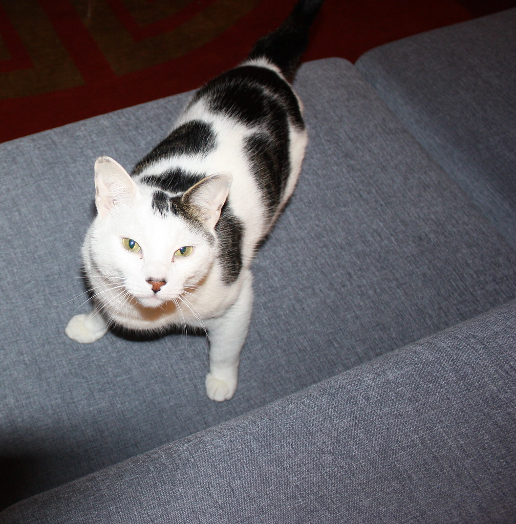
Black and White in Summer

The dining room, the space I declared finished in January 2006 and that we decided to add to the kitchen renovation, finally got its new clothes thanks to some design help from the Awesome Designer and a shopping trip to Kravet's Bethpage, NY showroom one rainy day back in April. 
The drapery fabric Solarte from Kravet Soleil, is a retro-vibe indoor/outdoor fabric that should stand up better to dog affection than the Dupioni silk that hung there before. 
Although it looks black & white in the stock image, there is a lot of subtlety in the shading - ebony, stone, mocha and a silvery pewter. 
The rug, Cap Ferrat, is, like the Chinese Chippendale now in the den, a design by Windor Smith for Kravet. The seafoam color marries well with the grey-green Benjamin Moore Titanium walls and the dark brown ovals are almost the exact shade of the beams and the mocha shading in the drapes. (Black, seafoam and the sun seem to have been a big part of this recent renovation. I think I'll have to invest in some black and white tea towels for the kitchen!).
All we need now are those pesky baseboards...
Saturday, May 08, 2010
Perfect Pillows Update

Six weeks or so ago the big blue sectional got a major dose of pretty when these gorgeous pillows arrived. They have been much admired but the Awesome Designer thought we could go the extra step and add some more gold tones for that unique touch. 
So with one medium-sized remnant and some real magic (plus exact measurements and a great eye) she produced these four fabulous cushions. Absolutely inspired!
Wednesday, April 14, 2010
Sleeping soundly

The Hoffman bed arrived Saturday so we happily traded crashing on a mattress on the floor for a real grown-up king-size bed. Paradoxically, the huge bed makes the room seem larger. I have no idea why this should be but I'm happily embracing the bonus. Better still, switching the furniture around allows me a fabulous view of the white magnolia from my side of the bed - at least until all the leaves on the beech tree open. More importantly we've been sleeping better for the past four nights than we have in the previous four years.
Apart from the art piled up in a corner - and a place to put the BeoSound1 - this room is DONE. For those who need to know how it compares with the original inspiration and the The Guy's updated design, here's the rundown:
Bed: Room and Board Hoffman in Teton, Ink
Bed Linens: ikea Andrea Satin
Media console and Bedside Tables: Room and Board Grove
Rug: Kravet custom
Sofa: ikea (no longer available)
Drapes: Habitat Pixel (no longer available)
Cornices: Custom (Awesome Designer)
Blinds: Smith and Noble Dark Mahogany
Paint: Benjamin Moore. Walls: Titanium; Ceiling: Cloud White; Trim: Bittersweet Chocolate
Original Abstract Art: Jamie Geller Dutra
The entire before and after timeline from Muenster Cheese to Bittersweet Chocolate is available for your delectation here.
Tuesday, April 06, 2010
Into the lion's den...

Normally The Guy's office looks like a cross between a recycling centre and the inside of a vacuum cleaner bag; papers are "sorted" into plies and allowed to settle until they've accumulated at least 4 cms dust; found objects, such as cairns (the stones not the dogs) will be strategically placed on the piles to mark who knows what along with cables, chargers, business cards and throat lozenges. Woe betide anyone who attempts to clean up this mess, and so, balanced carefully on a pile of papers or books, will be a duster, or swiffer cloth - maybe both - that he promised to use a week month ago to alleviate the worst of the dirt.
Yesterday I declared it a health hazard and took advantage of his absence to clean up. I also gifted him an assortment of box files and desk folders and sorted his documents and resources into easy to find sections. Well, I'll be able to find them, he may not be used to my filing system...
Now he has a tidy desk it's time to prettify the room - this Larry Laslo fabric Signify in Carnelian from Robert Allen is the exact same shade of red as the pendant lamp and is masculine enough to appeal to The Guy. It will be turned into roman shades by the Awesome Designer as soon as she's finished working on another little project for me...
Wednesday, March 31, 2010
Keeping your friends
 Interwebs regulars to this blog are aware that we lucked out when we signed up to take over The Cool House. Not only did we get a rock sold house in need of a little TLC and a piece of uniquely modern architectural history but we gained two of the best neighbors we could ever hope to have - the Awesome Designer and the Loyal Blog Reader. The former is the hands-on person in that partnership/ Furniture needs re-arranging? She'll move it fifty different ways until she gets the effect you're looking for (or the one she persuades you is best - trust her, it will be). Bulbs have to be planted? Give her a couple hundred and a dry weekend and the following Spring your garden will be carpeted with pretty flowers. Ask for a fabric swatch and she'll visit half a dozen showrooms and bring you swatches of undreamt deliciousness - and then spend hours pruning them until you have just the right palette to make your room perfect.


On the other hand, the Loyal Blog Reader is more cerebral and prefers to let the pros (like his wife) tackle things. Only rarely does he get roped into the renovation process, preferring to bask in the glory of the finished effect.

Which is why he is probably kicking himself this morning - or dreaming of kicking me maybe - when, after I plied him with wine and salumi, we persuaded him to take a hands-on role in the renovation and move a rug, or three, in and out of the car and up a flight of stairs - in the name of the beautification of The Cool House. To add to his nightmare I made him weigh in on the design discussion of some fifty pieces of fabric to determine the one that would epitomize our uniquely modern design aesthetic. So, I would like to heartily thank the Awesome Designer for all her help and hard work yesterday and to the Loyal Blog Reader I offer both my gratitude and profuse apologies. You can send the chiropractor's bill to me...
Wednesday, March 24, 2010
Something is Missing

When we were choosing fabrics for the Great Room sectional, way back in fall 2009, I pounced on a pale teal or seafoam color chenille and pronounced it perfect for the master bedroom. I had this idea that the I would paint the woodwork dark brown and the other colors would come from the Jamie Geller Dutra painting that I'd bought The Guy for his birthday a few years back. 
I wasn't sure whether it would be used as drapes or pillows but eventually I asked the Awesome Designer if she'd make some "valance boxes" for the bllnds and cover them with the seafoam chenille. Being a great designer she found a blue/black trim to subtly enhance the color and suggested we make a third for the Pixel drapes that The Guy refused to replace. Now the beautiful cornices (as I have learnt to call them) have been installed and we couldn't be more pleased with the way the room turned out.
The Room and Board Grove oil-and-wax walnut credenza and bedside tables have a mid-century vibe that fits our style and complements the other furnishings in the house. Everyone (including all the electricians, plumbers and carpenters who traipse through here on the way to the master bath) loves the black glass lamps (also from Room and Board but this time the clearance section - score!) and the skinny navy and white Italian floor lamp. Even the Samsung television has gotten a thumbs up; when it's on the bezel lights up with a red accent, matching a corresponding red stroke in the painting!
There's only one thing we need to complete the room, one very important last final piece to finish our dream space. Can you see what's missing? What would, in effect, elevate this room to new heights? That would give this room the comfort level it needs? Something I need to have positioned before the rest of the art can go back on the walls? The piece of furniture that defines this room won't now be arriving until mid to late April and it can't arrive to soon for me. I'm too old to be camping out on the floor...
Monday, March 15, 2010
Perfect Pillows

The fabulous fabrics I chose for the great room arrived and were quickly turned into stunning pillows by the Awesome Designer and her workshop. The square checkered pillows ground the more ostentatious rectangular cushions, making the sectional spectacular. 
We both feel we should add a third element here - something blue? A touch of gold? We shall see... Feel free to way in with your thoughts!
Saturday, March 13, 2010
Crewel Intentions

We officially missed deadline #3 on the master bathroom - in case you were keeping score, deadline #1 was Valentine's Day; #2 The Guy's birthday. The last, ultimate, had-to-be-done-by date was March 12 when a party of friends and family arrived from Europe and filled The Cool House to capacity. A fully, functioning bathroom was all I needed to keep me sane, but alas, the renovation gods had other ideas. Still, we pressed on positively and the design gods, or more specifically, the Awesome Designer, smiled. She waved her wand and worked a lot of magic on the guest bedroom.

Roman blinds and a bolster covered in Robert Allen crewel work cotton and wool fabric - Unity Rings in Confetti. The fabric has a little arts & crafts vibe mixed with a little retro and a great colorway for this house - another uniquely modern find.
Tuesday, February 02, 2010
Gold toned papers
The white tone on tone wallpaper samples that I sent for from Graham and Brown were a bust. The tone on tone Checker looked dingy and the Curvy didn't read at all, its beautiful geometrical swirls simply disappeared on the foyer walls. The black Checker looked better but was still too one note - not the play on shade I had been expecting. 
So, if the tone on tone is too boring and the terracotta and gold papers are just too much of a statement what, I wondered, if we went with a less bold color and pattern but a brighter, more metallic hue. Especially, as you can see in the photo above, we have more open spaces than solid walls in the foyer. What do you think?
Luna in Gold/Tan from Cole & Son via Lee Jofa 
Muse in Champagne via Lee Jofa
Carlu in Nickel 
or Gold by Designers Guild
Finally - grasscloth is very mid-century modern and it's making a comeback. W3043-24 is a 50% grass/50% paper blend in a real golden tone available from Kravet.
Wednesday, January 06, 2010
Golden Walls

Now that we have the furniture back in the Great Room, I asked the Awesome Designer, Julie Napoleon Brown, to bring back this paper, Grasses by Mulberry in Red/Gold to see if it would work for the foyer. Being a star, she also pulled a few more wallpapers in the same colourway. After I had carefully placed them aroud the walls, The Guy glanced around and uttered the fatal words: The trees in the forest paper is looking a lot more appealing! We'll ignore him, though and move on...
My initial favourite: Octavio by Mulberry in Copper/Red
The Guy's favourite (if he were forced to choose): Gilded Fresco in Red/Gold from Mulberry.
The two papers together in situ - maybe my choice is too geometric?
After seeing them all in daylight and by CFL lighting I'm being seduced by this Red/Gold/Rust beauty: Palm Court, Cole & Son, from their Vintage Glamour Collection.
At first I thought it was too Arts and Crafts but in real life it really shines off the wall
as does this sample of Grasses that I started with.
I'm no nearer make a decision, so Interwebs, please weigh in with you thoughts!
All wallcoverings available from Lee Jofa (trade only).
Monday, December 21, 2009
Big Blue Sectional Reveal
Ta-da! Drum roll please for the stunning reveal of the formerly pink super-sectional sofa
After: Original to the house 1968 Harvey Probber sectional re-upholstered with Kravetsmart in blue chenille by awesome designer Julie Napoleon Brown and her team. 
New rug is Chinese Chippendale design by Windsor Smith, also through Kravet, a 9' x 9' square terracotta silk and wool blend with a gold design and border. It's amazing what an appropriately sized rug does for the scale of the room. The sectional floats on the rug just as if it were made to measure.
Before: The sectional in its original rose pink fabric, faded by 40 years of sun streaming through those huge windows (and a little pet-related wear and tear); the too-tiny 5' by 8' rug we'd placed in front of the sofa as a temporary solution five years before. The pillows were hiding a huge split in the seat cushion that had been there for longer than that, which we'd originally covered with reindeer hide! Just out of view is a pink throw covering another hole and more than a few cat claw marks
During the re-covering phase the rug became a patch of carpet cast adrift in a sea of parquet. At this point I knew I had to go rug shopping. I can't say enough good things about the whole rug shopping experience at Kravet - they also have a fun blog Inspired Talk that is, as the name suggests, full of designer tips, resources and drool-worthy photos.
My greatest thanks, however, go to designer Julie Napoleon Brown without whom the project would never have gotten started, let alone turned out so spectacularly. She spent time trying to make an off-center sofa fit more cohesively in a trapezoid room; here she is considering the configuration of the 12-piece sectional
and shown here pondering the choice of pillow fabrics. 
She tolerated my control issues as I vetoed swatch after swatch and sample after sample, then had to repeat the process with The Guy, who doesn't respond well to imposed change (unless he is doing the imposing) but in the end, as you can see from the photo, is delighted with the redone great room. 
As Julie says, it needs a punch of the orange on the pillows and a few well-chosen accessories, which will come eventually (I can generally sneak one thing past The Guy each quarter), but for the moment - and most importantly - it has been cat tested and fully approved.
More Great Room before and after photos here
Saturday, December 12, 2009
Quick swap

I edged the blue sofa out and replaced it with the crimson Steelcase chairs the Awesome Designer picked up for me. You would not believe how much it lightens up the room.
before
after
The blue sofa is currently taking a break in the empty great room on its way to my office, which will happen as soon as I have taken my Incredible Hulk pills and got some super-strength in my arms and back or when Vez comes for the Holidays, whichever happens first - that thing is dang heavy!
Subscribe to:
Posts (Atom)


