


No porn in the title, but an almost orgasmic delight here at The Cool House; moaning and sighing over fabulously rich fabric samples on the table. Silks, damasks, chenilles, and velvet; modern, vintage, retro or art nouveau inspired, they all scream 21st Century uniquely modern style and at least one will be trimmed and turned into pillows for the great room sectional by the Awesome Designer and her team.

Silk Empire Vol III - Cinnabar colorway, pattern 800187H-551 from Highland Court Fabrics.

Also from the Silk Empire Vol III - Cinnabar from Highland Court Fabrics circles of gold on brick silk 180740H-113.

Kari in Cayenne from Kravet's Basics line.

Nocturne in Tomato/Gold 100% linen. By G. P. & J Baker through Lee Jofa.

Mint Flower Sil in Salmon designed by David Hicks, Groundworks through Lee Jofa.

Magic Circles Velvet in Terracotta by Mulberry via Lee Jofa.
All fabrics to the trade only. Favorites, anyone?
Showing posts with label design. Show all posts
Showing posts with label design. Show all posts
Friday, January 29, 2010
Fabulous Fabrics
Thursday, January 28, 2010
Sunglass Style
Even in winter you need sunglasses in New York; in fact I probably wear sunglasses outside more than I do regular eyeglasses and when I find a pair I like I wear them until they fall apart, then I get the optician to fix them and wear them into submission. I have one pair I bought in Belgium in 1996 that I wear for walking the dogs - the lenses are so degraded it's almost impossible to see through them and the plastic on the inside looks as if it has been sucked on by a teething child but they are so comfortable and look so good I have never been able to part with them. Still, it was time for a new model so I went shopping and found lots of vintage inspired eyewear to chose from. They are prescription lenses so you'll have to wait a while to see what I finally picked but here are the contenders:
Teal blue, brown and black - bold and sexy Paul Smith eyewear PS-3009 in Tustl 
Retro Hollywood glam Zooey in Ivory Shell with a Spice Brown Gradient. Oliver Peoples in collaboration with Zooey Deschanel.
Cool 70s inspired round frames - in tortoiseshell to accentuate the golden blonde highlights, Starbelle by Oliver Peoples.
Sunday, January 24, 2010
Elemental, Organic Mosaics
Designer Ellen Blakeley's singular vision allowed her to see how the vandalised glass of a bus shelter could be repurposed into a thing of beauty and elegance. She takes recycled tempered glass, mixes it with eco-friendly pigment and resin to produce custom tiles and panels of mosaic glass that can be used as a stunning backsplash, shower walls or even windows. Here are a few of my favourites:

Rich, red Pompeii from her latest collection, Elements- reinterpreting Earth, Water, Wind and here, Fire. It speaks to me an a primordial level.

The Spotlight collection, contains four sub-categories. Organic incorporates real leaves into the mosaic, here the cool, inspiring Silver Leaf - perfect for a spa bath.

Also from the Spotlight collection the sparkling Pop category in Mango colorway. I'd be happy every time I looked at this.

Finally appropriately named greens, blues and purples - Vineyard from the Core collection. It would fit right into The Cool House.
Intricate, dramatic, sustainable, unique - there is something for everyone in Blakeley's collections. You can order Ellen Blakely mosaic glass through Artistic Tile or via her showroom or you can just admire the images on her website and dream.
Saturday, January 23, 2010
Black and White
Hanging the House paintings in the foyer has me re-thinking the whole gold on terracotta wallpaper vision. The black frames and stark white mattes are leading me in another direction. I wonder what tone on tone black or white would look like in the space...
This Graham and Brown Checkered pattern via Design Public echoes the geometric shapes in the house without competing for attention. Available in white or black. (I also want the Vitra George Nelson Sunflower clock so bad).
The black flock wallcovering from Romo Laurito in Ebony from the Grandis collection would certainly make a statement. 
Gorgeous but maybe a little too like a snowflake? Marcel Wanders Stella wallpaper from Design Public available in white, black and a range of other colours.
Smudgy and edgy, Carlu Noir from Designers Guild also comes in Vanilla.
Or maybe a modern Anaglypta that we could paint would be the best way to go - we'd get texture while keeping control over colour. Graham & Brown paintable wallpaper in Curvy

Wednesday, January 06, 2010
Golden Walls

Now that we have the furniture back in the Great Room, I asked the Awesome Designer, Julie Napoleon Brown, to bring back this paper, Grasses by Mulberry in Red/Gold to see if it would work for the foyer. Being a star, she also pulled a few more wallpapers in the same colourway. After I had carefully placed them aroud the walls, The Guy glanced around and uttered the fatal words: The trees in the forest paper is looking a lot more appealing! We'll ignore him, though and move on...
My initial favourite: Octavio by Mulberry in Copper/Red
The Guy's favourite (if he were forced to choose): Gilded Fresco in Red/Gold from Mulberry.
The two papers together in situ - maybe my choice is too geometric?
After seeing them all in daylight and by CFL lighting I'm being seduced by this Red/Gold/Rust beauty: Palm Court, Cole & Son, from their Vintage Glamour Collection.
At first I thought it was too Arts and Crafts but in real life it really shines off the wall
as does this sample of Grasses that I started with.
I'm no nearer make a decision, so Interwebs, please weigh in with you thoughts!
All wallcoverings available from Lee Jofa (trade only).
Tuesday, December 08, 2009
Design Day

So you know how you start with one thing, say re-upholstering a distressed pink sofa, and then because you changed the colour you have to pick a new rug and pillow fabric and the next thing you know you've picked a wallpaper for the powder room and you're having a full-on argument with your other half about who has the better design ethics - in front of the professional with the credentials, taste level and portfolio to render any disagreement moot, the Awesome Designer for instance. You know that sort of a day? Well, that was my Monday.
The Awesome Designer, who does have a real name - Julie Napoleon Brown, and whose work you can see here, here and here - was devoting a few hours of her precious, much sought-after design time to take me rug shopping. Somehow that developed into a full-on entire day, including many hours spent pulling fabrics at Kravet's Long Island showroom.
Surprisingly, it was this square Chinese Chippendale carpet that made me gasp: coup de foudre, coup de coeur. It wasn't the colour we were looking for, nor the shape and certainly didn't read updated sixties chic -but it just leapt out at me and straight into my arms. 
The Awesome Designer set to work pulling co-ordinating pillow fabrics like this Barclay Butera Chinese inspired print as well as more retro weaves and blocks of bright blues and greens and terracottas that would marry the cool blue of the sectional with the warm tones of the rug. 
I got so carried away I suggested we look for a kick-ass wallpaper for the powder room and foyer - because you cannot expect that a newly-waxed floor in the great room onto which you've placed a sensual gold and terracotta rug surrounded by a freshly upholstered slate-blue sectional accented with one-of-kind cushions, will distract from the primer-over-wallpaper-base walls in the entrance hall, now can you? It would be more warthog with designer pearls than lipstick on a pig.
We hauled one rug home, plus two bags containing samples for a uniquely-coloured custom rug, fabrics for both options and a dozen or so wallpapers. Then we layed it all out in the great room to see what would work and what wouldn't. When we had it paired down to a cohesive design board we cracked open a bottle of white and awaited the arrival of The Guy who enthusiastically approved the rug and most of the pillow fabrics (including weirdly a zebra print we had put aside as a no-go) and out-right vetoed our paper choice (copper, black, gold and silver elms on a dark background that looks stunning in situ) saying he didn't want to feel like he was walking through a forest every time he went upstairs. Really interwebs, wouldn't you want to trip through the trees on your way to bed?
Anyway, another contender Grasses by Mulberry, and one that I really think would be more like weaving through a forest didn't make the cut either. The Guy's choice -walking through a town - is obviously not going to happen. We brought over The Loyal Blog Reader to mediate - but he wisely refused to get involved. Right now were are at an impasse on the foyer but, concentrating on the positive, we have a rug and pillow fabrics and the sectional will be back home next week. And, more importantly, I had a "girl in a sweet-shop" sort of day shopping with the best and most patient designer around.
Sunday, November 22, 2009
46 yards of fabric

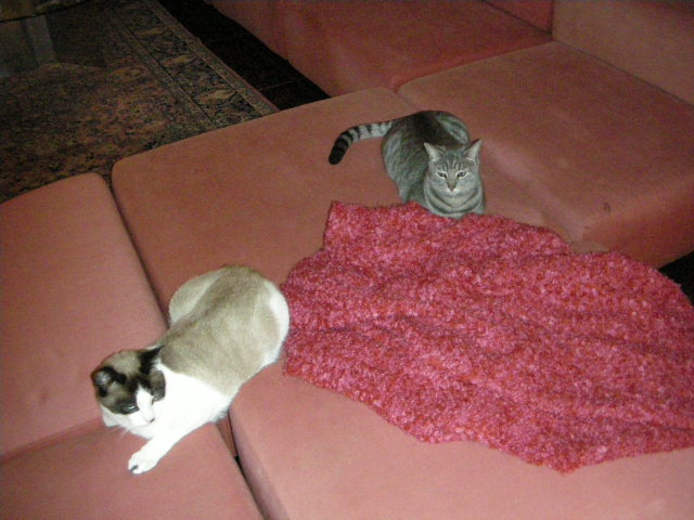
Say good-bye to the big pink sectional. The 12-piece Harvey Probber-designed 1968 chair and ottoman combination that is original to the house is about to get a huge, fabulous makeover. Jacques Brel up there recently got re-framed and has been looking down his nose ever since at the tufts of batting hanging from the torn upholstered corners. 
Finally the Awesome Designer decided she I couldn't live with the scratched up, spilt, holey mess it had become and kicked my butt offered to find a suitable fabric and re-upholster it back to its original glory. Over the course of a few weeks she bought me swatches - many, many swatches. She hunted all over the Island and into the City for the right fabric. We started with twenty or so contenders in browns and beiges, pinks, greens and blues - even a plaid
and soon there were more - many, many more - bags of chenilles, stripes and damasks in hundreds of hues. We narrowed down the palette to a range of blues and greens from pewter to denim to seafoam, and the pattern to a simple solid. I asked twitter and facebook pals to vote for their favourite, which helped narrow it down to four front-runners.
There was one fabric, a heavy-duty woven chenille, from the new range of fabrics by Kravet, the Kravetsmart that I loved above all others; it just felt right - soft but really hard-wearing. It's teflon-coated 102,000 double rubs so it should be bullet (or cat) proof.
I had to wait to see all the blue toned swatches but the end I chose the colour I'd always had in mind - a steely-blue that compliments the warm tones of the wood floors, ceiling and beams and the soft shade of the sandstone wall and echoes the bluestone fireplace and patio outside.
And now the fabric- all 46 yards - has arrived, the sectional is awaiting collection and the renovation will soon be underway. In a few weeks I'll be able to reveal the newly upholstered seating area... I can't wait!
Friday, November 20, 2009
The big bed bust or the super kitchen table steal deal

The DWR Annexe sale in Secaucus last weekend had plenty of bargains - there were lots of King-sized beds on sale, including the Matera that I loved, and all these tables that I've previously considered to replace our cafe kitchen table were substantially reduced. Not that we were looking for tables on Saturday but we were there and they were there, so...
This oval Saarinen had a black marble (Nero) top, too dark for our house - and we decided too big
This round Saarinen had the white Carrera top but it was the same size as the present kitchen table - too small
I was leaning towards the Matthew Hilton Cross table but it was only available in bleached oak - too light
The Warren Platner table that I didn't even consider because The Guy had vetoed it a few years back. The same Guy who called me across the room as I was checking the beds out. He had his whole hand on it and I think he would have licked the top if anyone other than a salesperson had come near him. He wasn't going to give it up. What could I say? It's the right period (1966), right shape, unique, classic, eco-friendly (Greenguard Indoor Air Quality Certified) and Warren Platner worked with Raymond Loewy just as Andrew Geller had done. Bonus - it has exactly the right dimensions for the kitchen. SOLD!
Thursday, November 19, 2009
Great Taste

Apparently an upholstered bed will work in a modern, mostly wood room. Check out this gorgeous house for sale in Vancouver 
The bathroom is pretty awesome, too
and I'm seriously in love with the kitchen.
Apparently the house was used as a location for a new film that has something to do with a popular TV series. Julia has the details...
Monday, November 09, 2009
Unique Animal
The Guy nixed half the bedroom inspiration. I had done all the prep work, all he had to do was tell me which of the three options he liked the most. I don't think he quite understood his role in the mission to redo the master bedroom/bath. Or maybe he decided "master" meant he was in charge of decorating decisions? I don't know, but he took one look at the George Nelson sconces and said "Huh? Yeah. NO"! A totally visceral reaction that was so loud he had the sales guy and two customers chuckling away. I was unamused. He then showed zero enthusiasm for any of the gorgeous walnut beds I'd been lusting after and eventually, after looking at and lying on a zillion beds in a few thousand stores (ok I exaggerate but it was a long day) he pointed at one across a room and said "That one".
"That one", the Hoffman at Room and Board, appeared to be everything he always said he hated about furniture - especially bedroom furniture. Firstly it was upholstered - he has allergies and we have a bunch of kitties that leave fur everywhere. Wooden and leather furniture you can wipe down with a cloth but fabric? All traces of dust or kitty have to be removed with a vacuum or roller-ball. Every. Single. Day. Then there's the style - it has buttons. The Guy hates trim of any kind and that includes buttons. I decided he was so hungry he must be hallucinating so I dragged him off to Mercer Kitchen for some lunch, where, I swear, he spent 90 minutes talking about the damn bed. I have to admit his reasoning was good - there was already a lot of wood in the room and sitting up to read in bed would be more comfortable. 
We went back after lunch to see if his feeling for the bed was true love or a mere infatuation. The temptress had more tricks in store - we he could choose the upholstery, including the retro inspired fabric above and the legs and it fitted with the Grove night tables, a pick of mine that he likes. When he found a mattress that felt like his beloved Swissflex he was sold; apparently he has never felt like this before. Not even the salesman's remark that Long Island is a unique animal and we'd have to pay extra shipping to have it delivered to the Incorporated Village deterred him. He has to have this bed. Is this a mid-life crisis? Should I be worried?
* Hi to all Homedigz visitors. All other visitors, go check out the Thanksgiving Blog Party over there
Sunday, November 08, 2009
Design Rules Winner
As all the design tips and comments, including the last, which was obviously born of a scarring design experience, seemed worthy of winning the book giveaway, I decided it would be fairest to randomly pick one winner. 
Using an olive green card (great color for Fall) and a humble biro (groundbreaking design), I enlisted the help of The Guy to draw one name from the pile. 
The winner of the Elaine Griffin's manual to successful stress-free decorating Design Rules: The Insider's Guide to Becoming Your Own Decorator is... drum roll, please...
Napoleon Woman. Congratulations! Email me at modernemama at modernemama dot com and I'll pass your details to the publishers Gotham Books/Avery | Penguin Group USA. And thanks to all who took part.
Subscribe to:
Posts (Atom)


